Probably one of my most favorite projects so far. I had the opportunity to rebrand a Kombucha Brewery based in Buffalo, New York. Although this was for practice, I had a lot of fun doing it.
About Bootleg Bucha
Bootleg Bucha is located within Buffalo, New York which started in 2015. The Kombucha Brewery is owned by a few business partners who teamed up from their homes then moved into a larger facility to start mass production in selling their Kombucha.
Currently, their brewery covers a 11,000 square foot facility allowing them to have plenty of space to try out new recipes, such as their Apple Cider Vinegar. Now, much of their Kombucha can be found along the eat coast and they are hoping to continue their expansion. As of the moment, they are the largest Kombucha Brewery in New York state.
The Rebrand Process
Although they are continuing growth in their company, they still need a sort of a “push” to further enhance their brand. However, the company has recently already undergone a rebrand, but it was my job to find those limitations they left behind and advance them further.
As I did my research I realized that their logo wasn’t quite “Bootleg” enough for me, which was one of my targets of interest. Another, was recreating their value proposition and mission statement, only because I couldn’t find a solid one that they use consistently.
Also, their target audience, according to their website, is to appeal to everyone. Which isn’t a bad thought to aim for but I thought that just having one select group of individuals would be more beneficial.
And Lastly, I needed to revamp their bottle labels and also create posters as well. I wanted to make their new bottles stand out from the rest of the competition and give it a refreshed look and be consistent with everything.
Target Audience
Although Bootleg Bucha wanted to initially appeal to everyone, I wanted to enhance this further by finding a select group of individual to appeal towards. I did some research and found that the millennial population had the highest Kombucha consumption, particularly the hispanic community.
With this information, I took the opportunity to theme my palette in more vibrant tones to match the Spanish feel, while also keeping the logo toned to appeal to the millennials as a whole. I wanted to create something eye-catching and less dated.
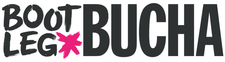
The Logo
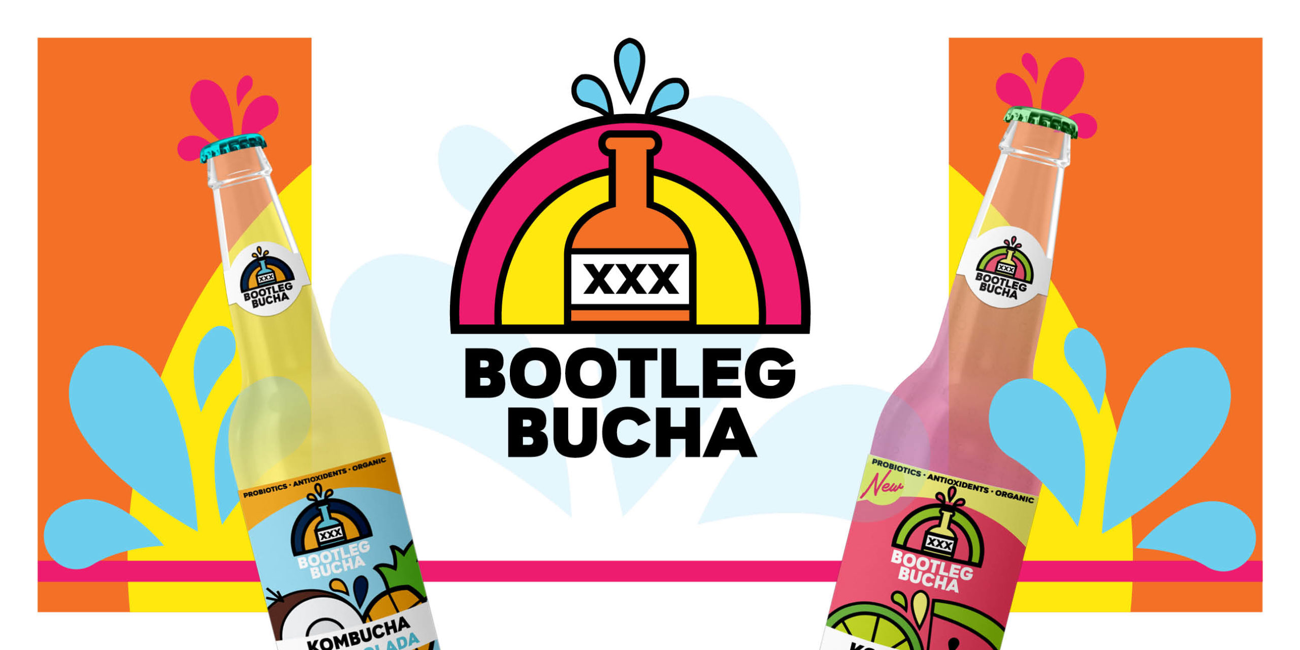
My first approach to the logo was to make it more grudge-like and text heavy. As I started to mess with this idea it didn’t turn out the way I hoped. This let down then lead me to do a bit more research into “moonshine” logo ideas. I then spiraled down various renditions and plenty of wild west inspirations, however, I wanted something a bit more modern.
This approach lead me to balance a typographical and illustrated balance in the logo. And with the Spanish colors I used I wanted it to look refreshing. I knew from the start I wanted a bold font to match the illustration and I found the perfect match.
The Label
The original labels didn’t appeal to me as much as I hoped, and with the new logo, I wanted to make it stand out even more. After growing some inspiration I knew I wanted something refreshing and less dry of a label.
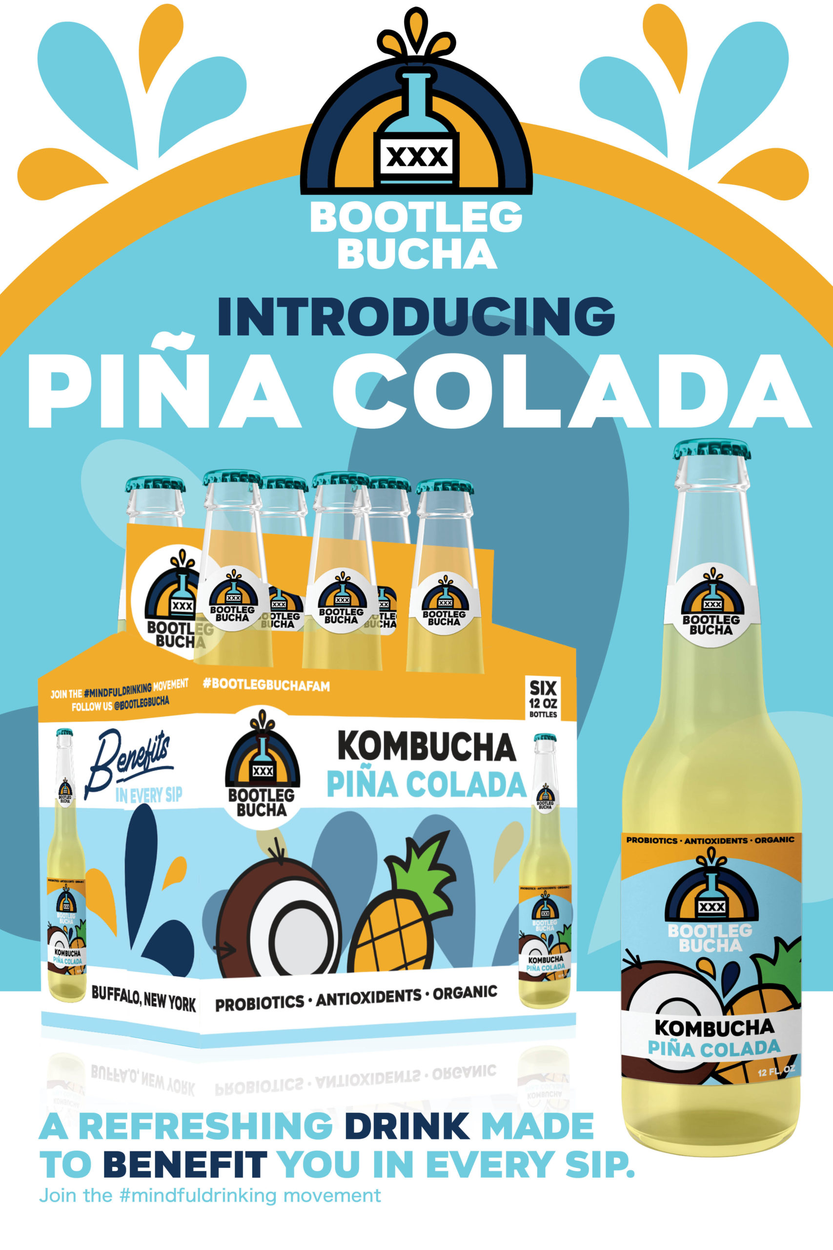
To achieve this look, I pulled elements from the logo to build the label around. I also thought that fruit would be a nice way to illustrate the refreshing aesthetic.
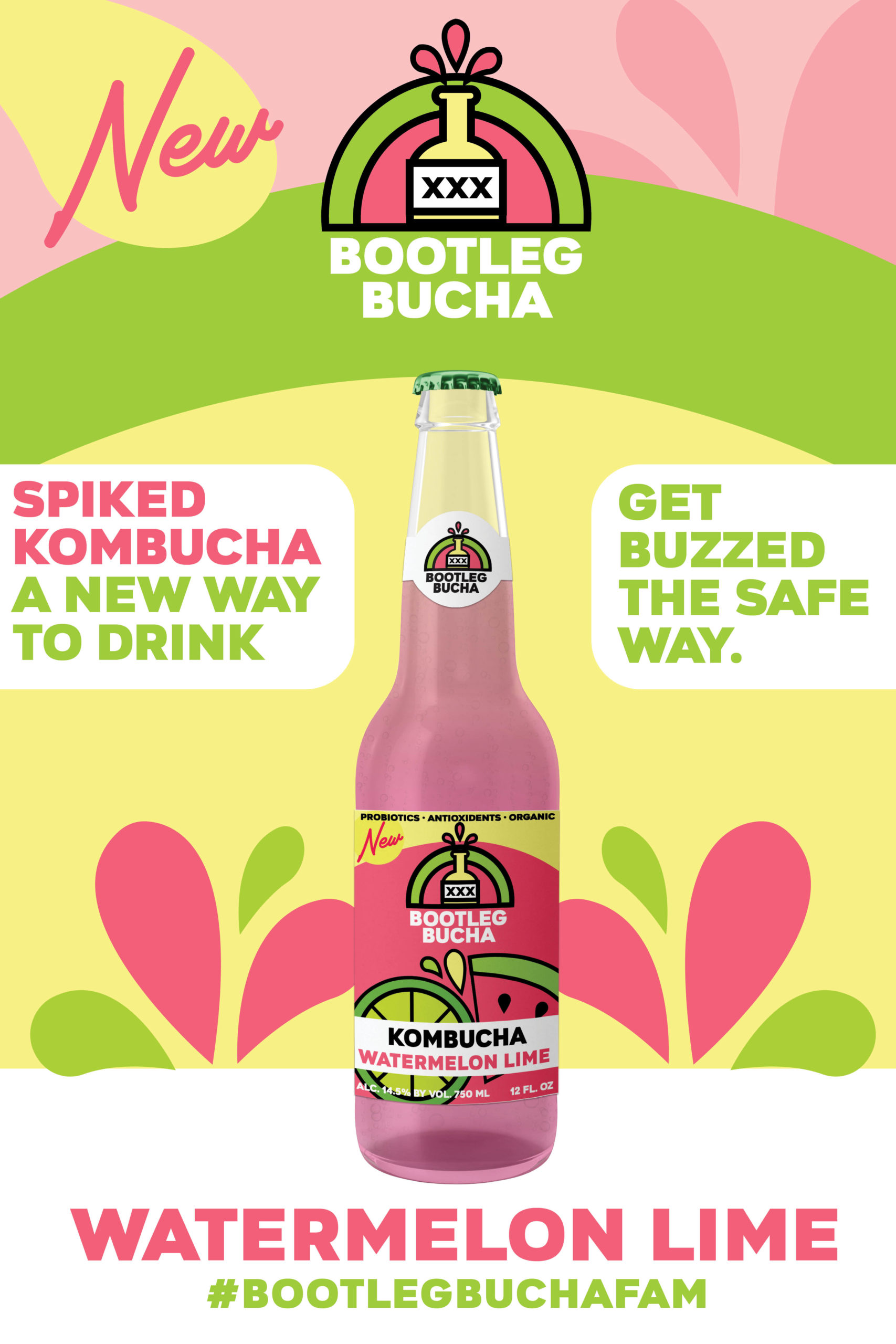
Also, included in my rebrand, I wanted to feature a spiked Kombucha which lead me to create “Watermelon Lime”.
Another thing I changed up was redoing their cylinder shaped bottles into a beer bottle shape. I did incorporate the old elements of the previous label by keeping antioxidants and organic features included at the top of the label.
Bucha Mission Statement
For their mission statement I took my time researching what their drinks had in them in order to advertise it properly. I also wanted to make sure mindful drinking was prominent as good SEO practice. This is what I came up with:
“From the kitchen to the shelves. Bootleg Bucha provides a healthier alternative to drinking. Bootleg Bucha started off in a small New York kitchen, and now, Bootleg Bucha is the biggest Kombucha brewery in all of New York State.
Bootleg Bucha now features both non alcoholic options and alcoholic options for you to choose from. All selections feature organic, antioxidant and probiotic minerals in every sip giving you most out of your drink. What are you waiting for?
Start your mindful drinking journey today, the smart way.”
Bootleg Bucha Value Proposition
When it came to the Value Proposition, I did struggle a bit to come up with a solid idea. At first, my objective was to tie in some sort of history into it, which lead me to come up with “From the Kitchen to the Shelves,” however, this wasn’t pushing the mindful drinking idea enough.
I was stumped for a moment because I wanted to incorporate the benefits into it somehow. And after some reassessing I came up with this:
“Made to Benefit You in Every Sip”
Posters
One of the last thing I had to do was to create posters for the new aesthetic. I wanted something vibrant and refreshing and definitely eye catching. I also had to go on the hunt for a good bottle to advertise around and I also found a 6 pack mockup that I could include as well.